|
|
Snowboard Image Tutorial
[THIS TUTORIAL IS IN THE PROCESS OF BEING UPDATED.]
When searching for artwork for your snowboard, you're not just looking for something that'll look SUPER "cool" on the
slopes. The image you choose must also be SUPER big so it will cover the entire board (at least 20MP),
and be of SUPER high quality so that it doesn't look pixelated and/or blurry when printed.
The following is a 'how to' on finding the best images, how to save them,
and preparing your snowboard artwork for class.
Questions? Please feel free to ask your instructor and/or the graphic designer! Good luck!
For ideas and examples of finished designs, click here.
|
SEARCHING GOOGLE
|
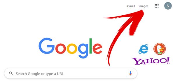
1) Open the web browser of your choice and search IMAGES. For this example, we're using Google
|
|
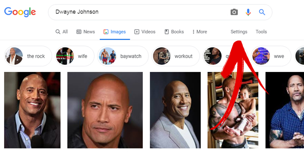
2) Search for the object, landscape, sports team logo, actor/actress, etc. of your choice.
For our example, we're searching for: "Dwayne Johnson"
|
|
3) To ensure your image is big enough (because snowboards are HUGE!), search images by size.
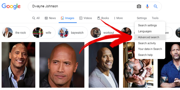
To do this in Google, click SETTINGS in the upper right.
Then, in the drop down menu, select ADVANCED SEARCH.
|
|
4) Next, in Google's Advance Image Search, go to IMAGE SIZE, select LARGER THAN 20 MP, then select the
ADVANCED SEARCH button. This will bring up the search results of images that should be large enough to fit on the snowboard.
|
<
|
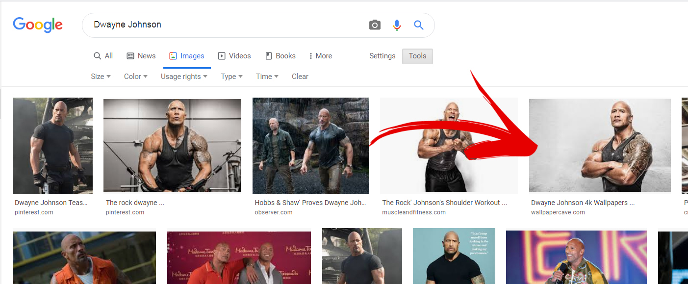
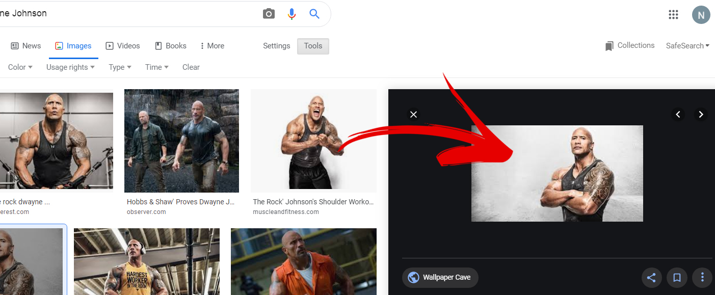
5) On the new Google search page, find an image you like (right) and click on it to bring up the photo's details
(left). Clicking on the image here will take you to the source website where the full sized image exists and can be (*hopefully) downloaded.
|
|
* I say "hopefully" the image can be downloaded because sometimes only a thumbnail version of the
full sized image is accessible on its source website. You may have to perform this search several times before you find an
image big enough to work for your snowboard.
|
WHY IMAGE SIZE MATTERS
 |
In another search for images, we found this amazing artwork based on a local sports team.
Pretty cool, right? The actual dimensions of this image are 1020 x 1016. It might
look big enough on your computer monitor, but is it really big enough to cover the snowboard? |
| Unfortunately no, not big enough. When we paste it into the HUGE snowboard template, it looks like this. |
 |
| So just make it bigger!" you say? Well, we could do that, but it's not a good idea.
Making small images bigger tends to cause blurriness and pixelation. |
 |
NOTE: Pixelation is when an image is broken up into pixels so individual squares of color are apparent to the viewer.
 |
See the original size on the left? When we make it big enough to fit on the snowboard,
it becomes a blurry collection of squares (see right).
This is why, we prefer 20MP+ images instead.
|
NOTE: WE love 20MP+ images! Teeny, tiny photos do not look super awesome blown up to snowboard size.
PROPORTIONS
 |
In addition to pixelation, keep in mind how images are resized.
Images can be "stretched," for artistic purposes, but generally resizing in equal proportions
tends to look best (i.e. any change to an image's height is equally changed to its width).
This applies to text (fonts) as well, though manually entered text (as opposed to images of text)
can be sized up and down.
Your best bet is to find, not only a BIG image, but an image that will fit the
proportions of the snowboard (wide verses tall).
|
SELECTING A PHOTO
Once you've found an image(s) that meets the size requirement, it's time to view it, check it, and save it!
NOTE: Preferred file types are JPG, PNG, TIFF and in a pinch PDF, GIF, or BMP.
Please avoid images embedded in documents (i.e Powerpoint, Word, etc.).
|
1) Once you've found an image(s) that meets the size requirement -
like this panoramic Thor comic book shot - search the source website for your image. It may appear full sized,
as a link, or in thumbnail form (a teeny tiny version of the image as seen here). As said before, it can sometimes be a little tricky
to find it.
|
|
3) To open the image so you can potentially save it, RIGHT CLICK on the image or link and select
OPEN IMAGE IN NEW TAB. This will, as you might expect, open the full sized image in a new tab.
|
|
4) Please note: A 20MP+ image may look good in the preview, like this one,
but that doesn't guarantee it's still not pixelated. To be sure, we now need to check it at full size.
|
|

5) To check your image at full size, put your mouse arrow over the image until you see the zoom in icon and click once.
This makes the image full size. Scroll up/down, left/right. Use CTRL + to zoom in and
CTRL - to zoom out. Is the image flawless or fuzzy? If your image is flawless, it's time to save it!
|
|

6) To save, put your mouse arrow over the image again til you see the zoom out icon and click once.
Next, right click on the image once and select SAVE IMAGE AS.
|
|
7) In Class: Go to (A) DESKTOP, click (B) NEW FOLDER, then (C) name the new folder (e.g. "John Doe"), open it, and save your image there.
Rinse/repeat for all images for your design.
At home: Save image(s) to a USB flash drive and bring in to class.
|
NOTE: Time is limited to create and print graphics, so if you will miss one or more of the first
2 days of class, please notify your instructor ASAP to avoid delay.
CREATE A SKETCH
With your images sorted, use our snowboard template (click on image below) to sketch out your ideas.
When sketching, please be aware of:
- Foot, Stomp Pad, & Bindings: Images on or near these areas will be covered.
- Alignment: The top sheet can slide during the application process,
so we don't recommend aligning objects and/or text to the edges of the snowboard.
SNOWBOARD TEMPLATE
Click image below for PDF
TEXT & FONTS
Many students like to add text to their snowboard. Whether it's a favorite quote,
a name, or an artistic addition, it's important to know what kind of font you want to use.
A font determines how your text appears, it's style. There is an infinite number of fonts to choose from,
but here are a few categories to consider:
- Serif & San Serif (e.g. Arial vs. Times New Roman)
- Script (e.g. Edwardian Script)
- Bold (e.g. Impact, Stencil)
- Old Style (e.g. Gothic, Old English)
- Western (e.g. Playbill)
You don't have to have a specific font name(s) when you meet with our graphic designer
(though four stars if you do!), but a basic idea of the look your going for will help!
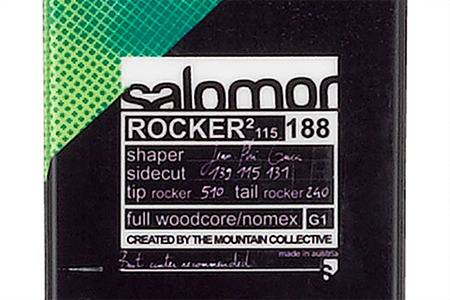
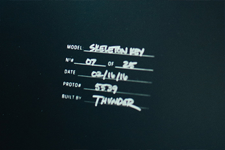
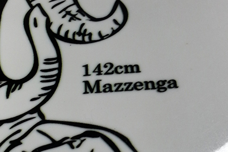
TITLE BLOCK
Another final addition many students like to add to their board is a title block. This is the area that
contains data about the board such as length, weight, materials, and location of manufacture
(e.g. ASM Training).
WORKING WITH THE GRAPHIC DESIGNER
Submit your sketches, images, and details to the graphic designer (via USB flash drive, student server, etc.).
From there they will work to bring your ideas to life!
NOTE: When working with the designer, please have:
- Be Flexibility: For various reasons, the final design may need to be different from the original vision.
- Have Options: Multiple ideas, multiple versions, and multiple images. Four stars!
- Be Zen: Never fear, your design will be awesome. Time, however, is limited, so strive for serenity.
THE FINAL PRODUCT
If all goes as planned, your awesome graphic will be sent for print by day 3 of class!
THE END
|
|
|